A client once told me about their previous website project. Three rounds of revisions. Two missed deadlines. A final product that looked fine but converted terribly. They spent $12,000 and nine months on a site they wanted to replace within a year.
This story isn't unusual. It's the norm.
Website redesigns fail at an alarming rate. Not because designers lack talent or clients lack vision. They fail because everyone skips the part that matters most: knowing what the site needs to accomplish before anyone opens a design file.
The real problem isn't design. It's sequence.

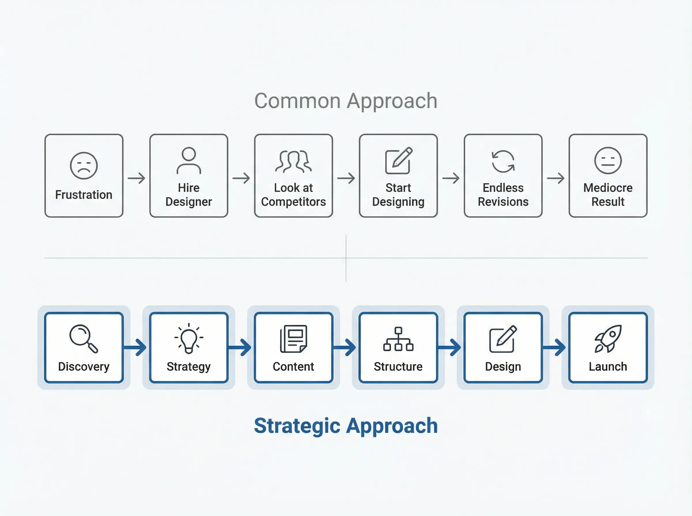
Most website projects follow a predictable pattern. The business owner gets frustrated with their current site. They hire a designer. They look at competitors for "inspiration." They start making pages.
Somewhere around revision four, the feedback becomes vague. "It doesn't feel right." "Can we make it pop more?" "I'll know it when I see it."
These phrases signal a deeper issue. The project lacks a foundation. Without clear positioning, defined audience understanding, and agreed-upon goals, design becomes a guessing game.
What happens when you skip strategy
When you jump straight into design, several problems compound:
The designer makes assumptions about your audience that may be wrong. Your feedback becomes subjective because there's no objective standard to measure against. Revisions multiply because everyone is chasing a feeling instead of solving a defined problem. The final site looks like your competitors because no one articulated what makes you different.
Your website should be a salesperson, not a brochure. A salesperson needs to know who they're talking to, what problem they're solving, and why someone should choose you over alternatives. Without that information, they're just making small talk.
The discovery gap
According to established website redesign methodology, a comprehensive process should begin with discovery and research: auditing technical performance, analyzing user behavior, reviewing competitors, and conducting user research to identify friction points and opportunities.
Most projects skip this entirely or treat it as a formality.
The consequence is predictable. You end up with a site that looks modern but doesn't perform. Traffic stays flat. Conversions don't improve. Six months later, you're wondering what went wrong.
Strategy creates the brief that design follows

The solution isn't more design talent. It's more clarity before design begins.
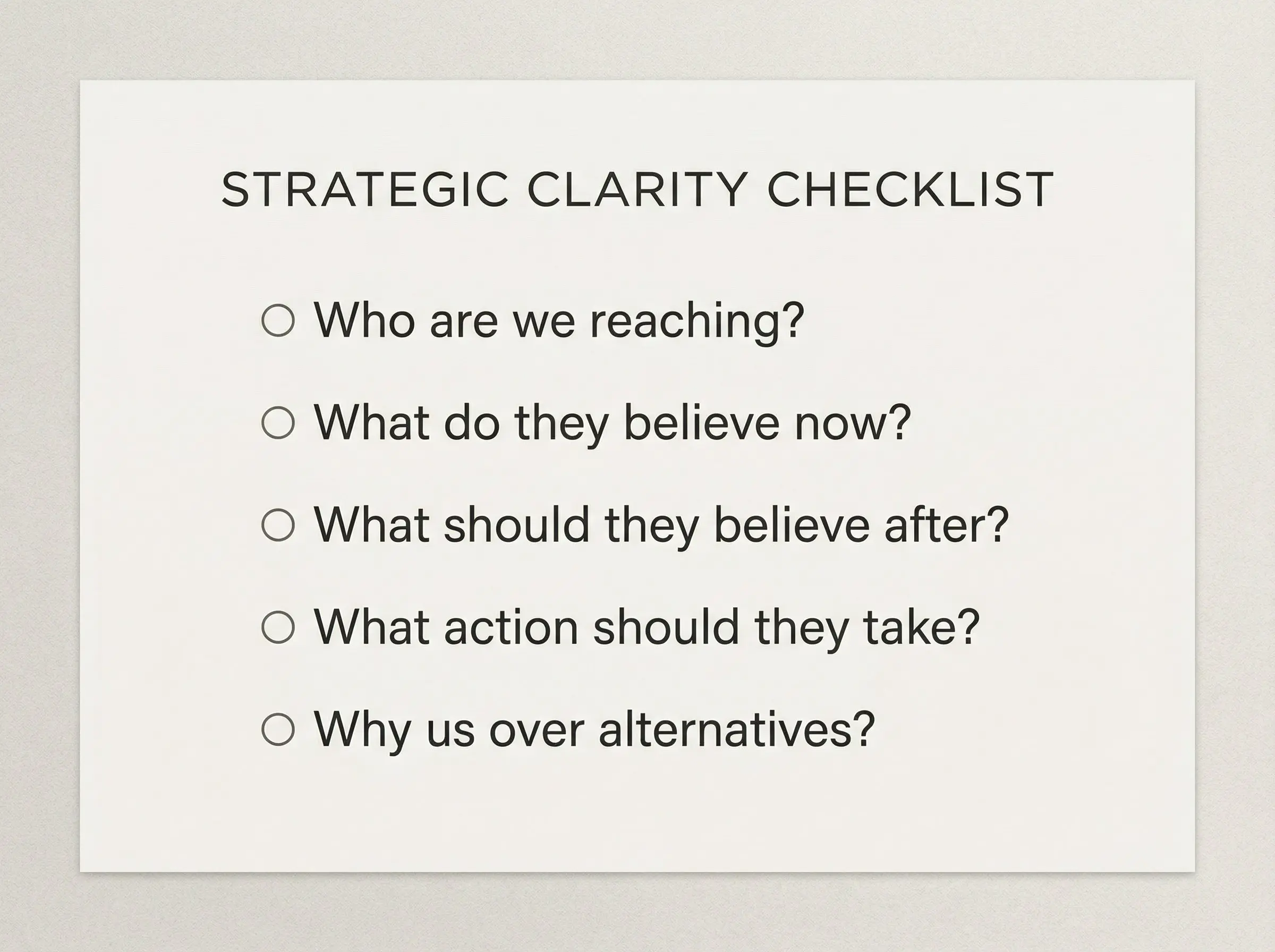
Strategic clarity means answering specific questions: Who exactly are we trying to reach? What do they believe before they find us? What do we want them to believe after? What action should they take? Why should they trust us over alternatives?
These answers become the brief. The brief informs the sitemap. The sitemap guides the wireframes. The wireframes shape the design. Each step builds on the previous one.
When you have this foundation, feedback transforms. Instead of "make it pop," you can ask, "Does this communicate our key differentiator?" Instead of "I'm not sure about the colors," you can evaluate whether the visual tone matches your positioning.
Content before layout
There's a common misconception that you can figure out the words after the design is done. This approach creates friction.
Designing with real customer information and close-to-final content is always the best case scenario. Spending hours on the words themselves before opening a design file prevents the most common problems: layouts that don't fit actual content, messaging that contradicts the visual direction, and endless revisions when reality meets concept.
Start by mapping out what you need to say. What information are users looking for? What do they need to know that isn't obvious? What misconceptions do they have? A bulleted list of these topics will inform the categories of content you'll work with.
The minimum viable process

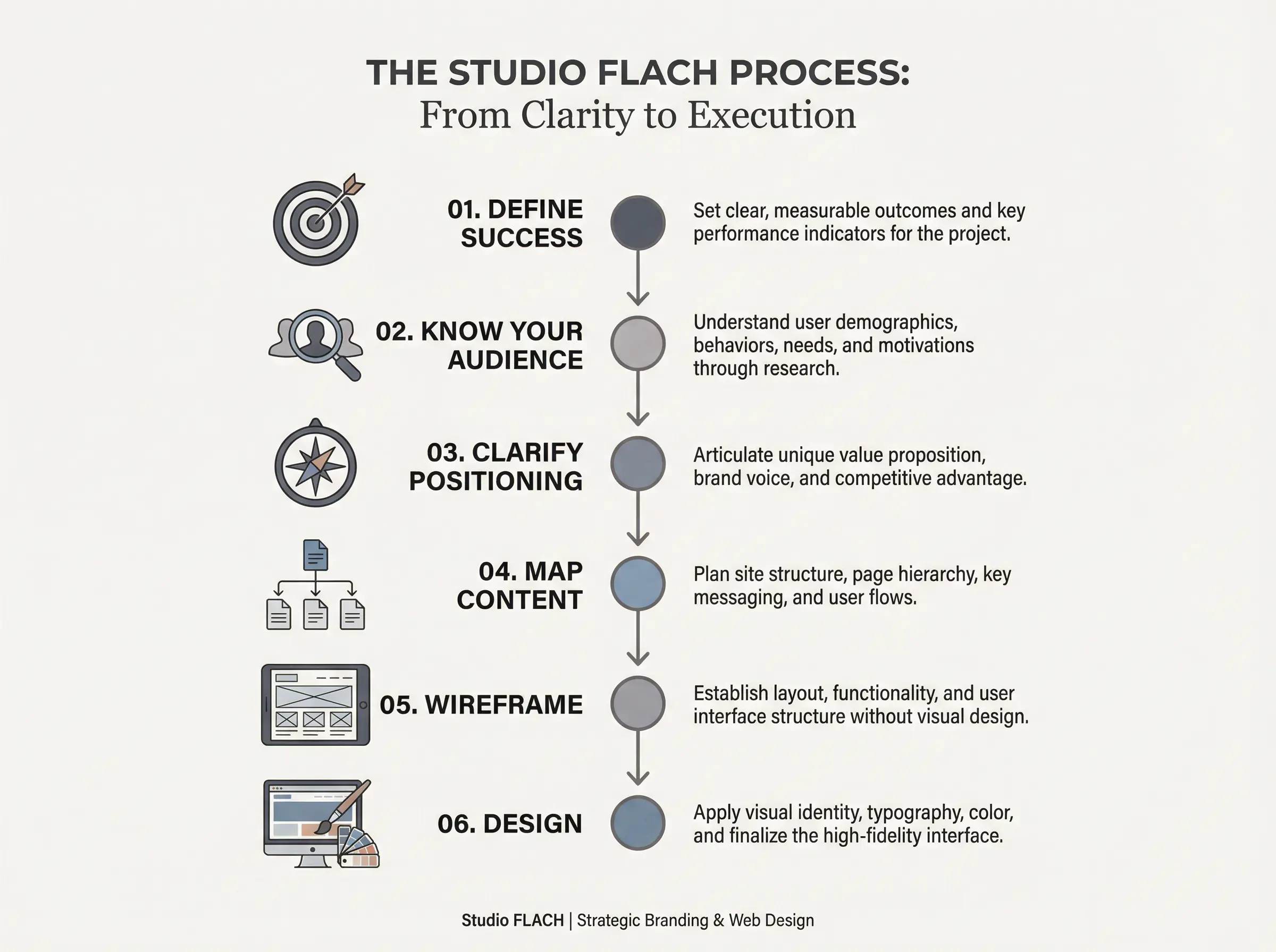
If you're planning a website project, here's the sequence that prevents expensive failures:
First, define success. What specific outcomes will tell you the project worked? Increased contact form submissions? Lower bounce rate? More qualified leads? Without metrics, you can't evaluate results.
Second, know your audience. Demographics, behavior patterns, objections, and motivations. Your client should have this data somewhere. Find it before design begins.
Third, clarify your positioning. What makes you different? Why should someone choose you? If you can't answer this clearly, your website can't either.
Fourth, map your content. What pages do you need? What will each page say? What action should each page drive? A simple list format works: page name, purpose, key message, desired action.
Fifth, wireframe before visual design. Establish layouts and user flows without colors, fonts, or images. This separates structural decisions from aesthetic ones.
Sixth, then design. With all of the above in place, design becomes execution rather than exploration.
Why this feels slow but saves time
Spending two weeks on strategy before design begins feels like a delay. It's actually insurance.
Without strategy, you'll spend those same weeks in revision cycles. You'll pay for exploration through iteration instead of through planning. The total time is often identical. But one path produces clarity and a site that works. The other produces frustration and a site that doesn't.
The question to ask any designer
If you're hiring someone for your next website project, ask them one question: "What do you need from me before you start designing?"
If their answer is "just your logo and some inspiration sites," proceed with caution. If their answer involves discovery calls, positioning discussions, content planning, and defined success metrics, you're more likely to end up with a site that actually works.
The best website projects aren't defined by the talent of the designer. They're defined by the clarity that exists before design begins.

