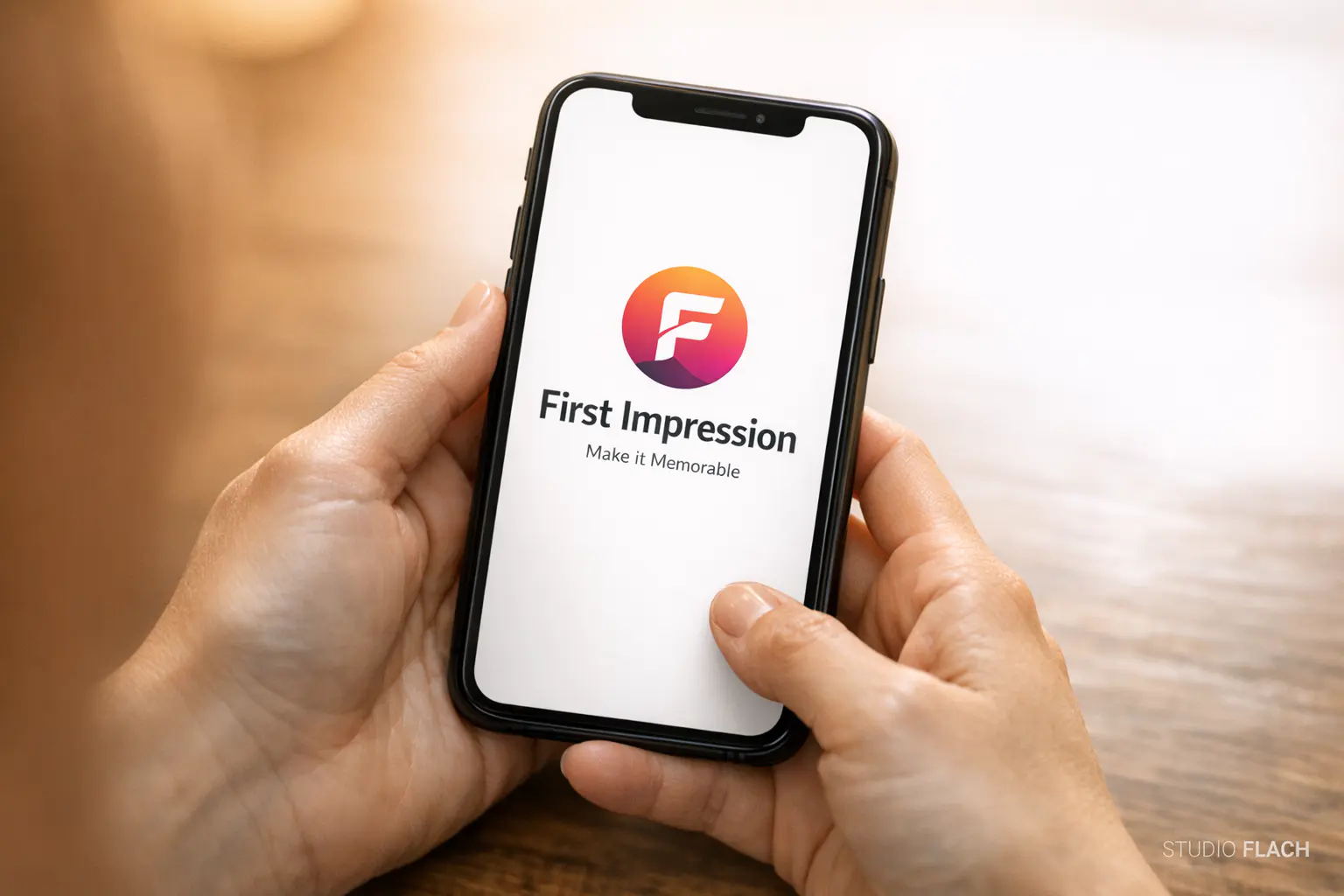
Your Pitch Doesn't Matter Yet
You've spent weeks on your elevator pitch. You've rehearsed the origin story. You know your differentiators cold.
None of it matters if your brand already lost the room.
Before anyone reads your about page, sits through your sales deck, or hears your carefully crafted value proposition, they've already made a decision. Not a conscious one. A gut-level, almost involuntary judgment about whether you look like someone worth paying attention to.
That judgment happens fast. Faster than you'd like.
The Science Behind the Snap Judgment
Research from Google and the Missouri University of Science and Technology found that it takes roughly 50 milliseconds for a visitor to form an opinion about a website. That's 0.05 seconds. You blink slower than that.
And the judgment isn't about content. Visitors aren't reading your headline or scanning your services list in that window. They're reacting to visual design: layout, color, spacing, typography, image quality. The surface-level stuff that most business owners treat as an afterthought.
Here's what the research consistently shows:
- 94% of first impressions are design-related, according to a study published in Behaviour & Information Technology
- Visitors who distrust a site's design are unlikely to engage further, regardless of content quality
- Perceived credibility is tied directly to visual professionalism
This isn't about aesthetics for the sake of aesthetics. It's about whether your brand passes the trust test before you even get a chance to speak.

What People Actually Notice First
When someone lands on your website or sees your brand for the first time, their brain processes a handful of signals almost simultaneously. These aren't things people consciously evaluate. They just feel them.
Visual Consistency
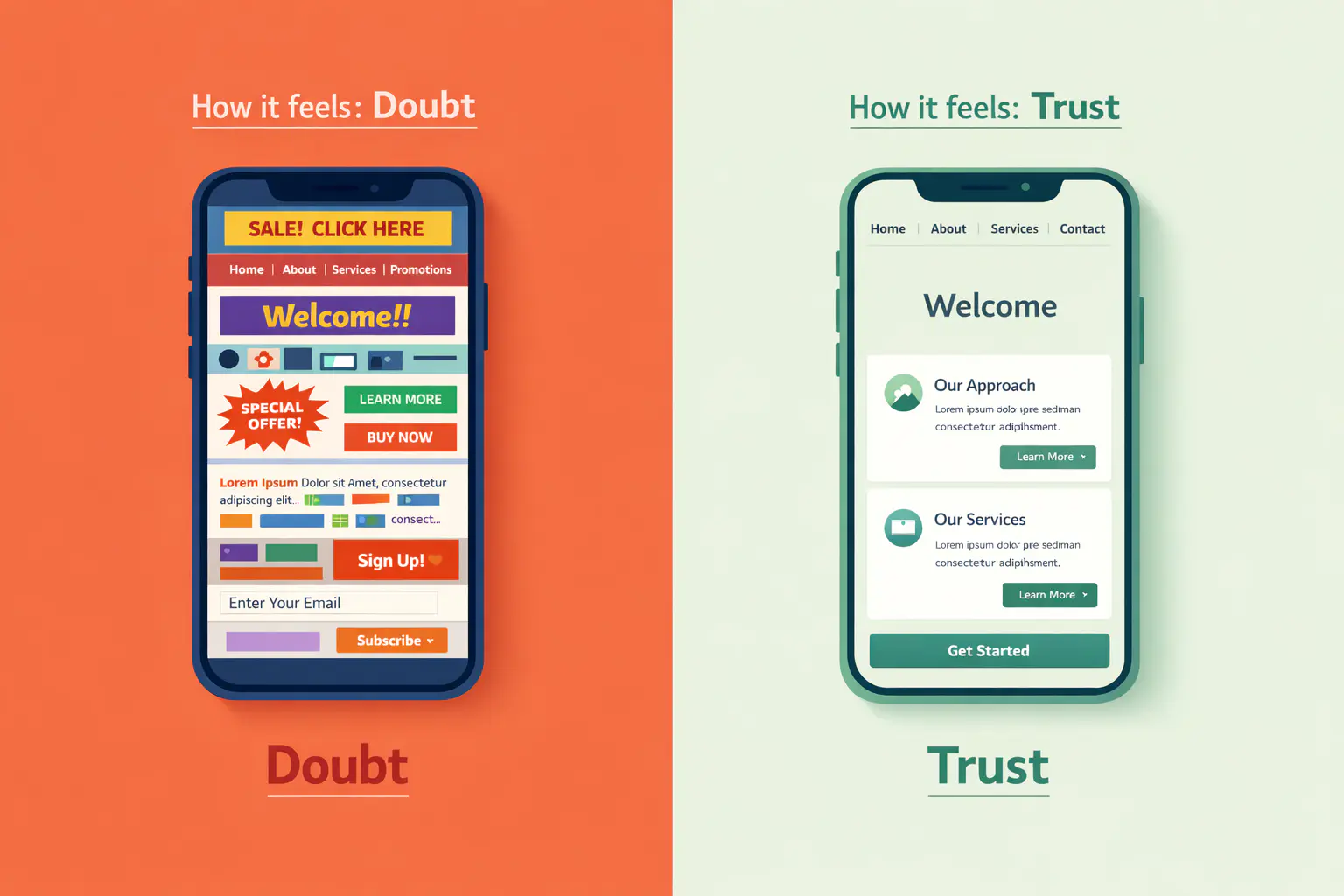
Does everything look like it belongs together? If your logo feels like it came from one era, your website from another, and your social media from a third, the brain registers that as disorder. Disorder reads as unprofessional. Unprofessional reads as risky.
Consistency means your colors, typography, imagery style, and tone of voice all point in the same direction. Every touchpoint should feel like it came from the same source.
Spacing and Clarity
Crowded designs signal desperation. When everything on a page screams for attention, nothing gets it.
White space isn't wasted space. It's a signal that you're confident enough to let your message breathe. The brands that feel premium almost always use more space, not less.
Typography
This one is underestimated constantly. Fonts carry tone. A law firm using a playful handwritten typeface sends a confusing message. A children's brand using stark, corporate sans-serifs feels cold.
Typography should match the personality of the business. And it should be legible on every device, at every size.
Image Quality
Stock photos that feel generic. Pixelated logos. Low-resolution headshots from 2014. These things register immediately, even when visitors can't articulate why the site feels "off."
The quality of your imagery tells people how much you care about details. If you cut corners on the visuals they can see, they'll assume you cut corners everywhere else too.
The Credibility Gap
Most businesses don't have a quality problem. They have a perception problem.
The work is good. The clients are happy. The results speak for themselves. But the brand looks like it belongs to a company two stages behind where the business actually is.
This creates what we call the credibility gap: the distance between how good your business actually is and how good it looks to someone seeing it for the first time.
When a potential client compares your brand to a competitor's and yours looks less polished, you don't get the chance to explain that your service is better. You just lose.
The credibility gap costs money. Not in obvious ways, like a bounced check. In invisible ways: the lead who visited your site and didn't reach out, the referral who Googled you and chose someone else, the proposal that lost to a competitor who simply looked more established.
What a Brand That Earns Trust Looks Like
A trustworthy brand isn't about trends or expensive production. It comes down to four things:
- Intentional design choices. Every color, font, and layout decision should trace back to who your audience is and what they need to feel in order to take the next step.
- Consistency across every touchpoint. Your website, social profiles, proposals, email signatures, and business cards should all feel like chapters in the same book.
- Clarity over cleverness. If a visitor can't figure out what you do and who you do it for within a few seconds, the design has failed its primary job.
- Professional execution. Spacing, alignment, image quality, responsive behavior on mobile. The details that separate something "designed" from something thrown together.
None of this requires a massive budget. It requires intention.
The Real Cost of "Good Enough"
Business owners often tell themselves their brand is "fine for now." And sometimes that's true, for a season. But "fine" has a shelf life.
As your business grows, your audience changes. The clients you want to attract next year are pickier, more discerning, and more visually literate than the ones you started with. They compare you to your competitors in seconds, not minutes.
A brand that was "good enough" when you launched can quietly become the thing holding you back. Not because anything broke. Because you grew and it didn't.
Where to Start
If you suspect your brand isn't keeping pace with your business, start with one honest exercise.
Pull up your website on your phone. Open a competitor's site next to it. Look at both as if you've never heard of either company.
Which one would you trust with your money?
If the answer isn't yours, the 5-second test is telling you something. And the good news is, it's fixable. A brand built on real strategy and professional design doesn't just look better. It works harder, every single day, on every single touchpoint, whether you're in the room or not.
That's what we build at Studio FLACH. Through Strategic Clarity™ and True Mark™, we create brand identities rooted in research and positioning, so your first impression does the heavy lifting long before your pitch ever starts.
