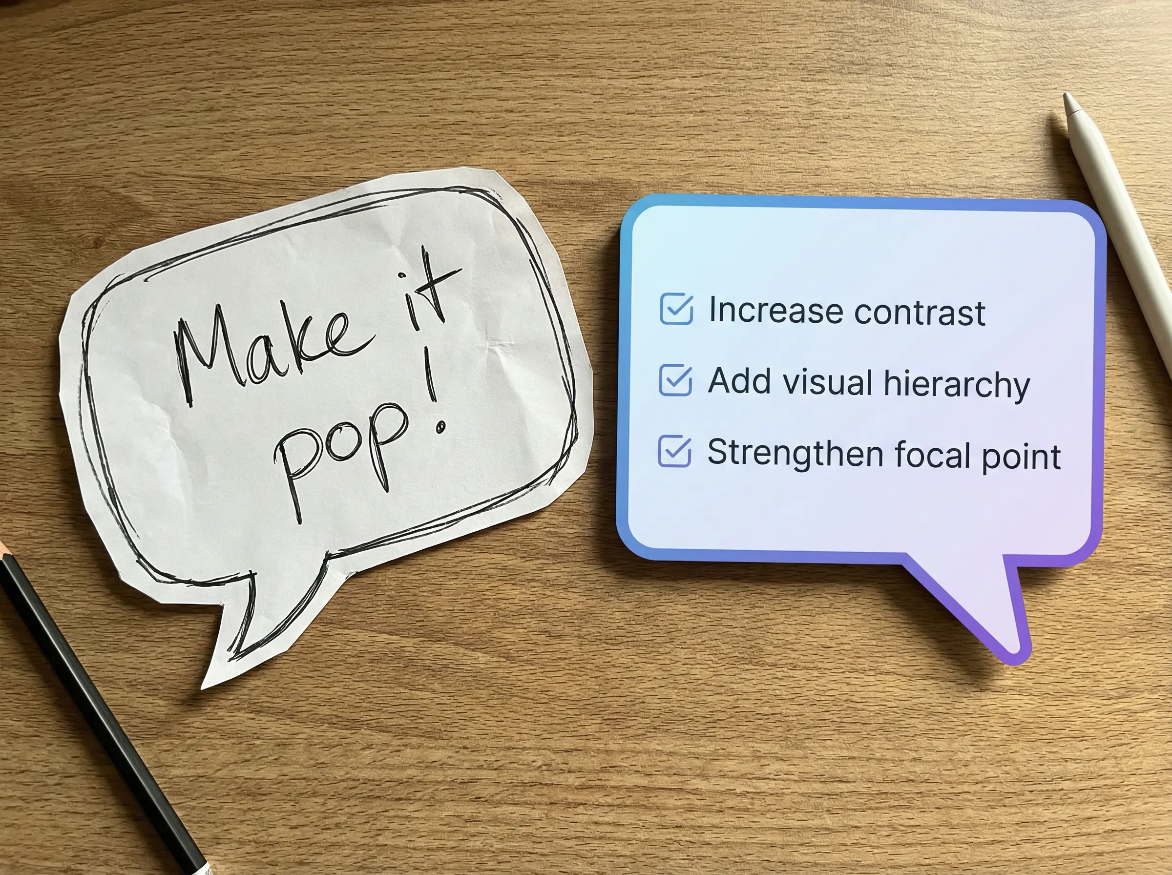
"Can you make it pop more?"
If you've ever worked with a designer, you've probably said something like this. If you've ever been the designer, you've definitely received it.
Here's the thing: this feedback isn't bad. It's incomplete.
When a client says "make it pop," they're communicating something real. They're looking at a design and feeling a gap between what they see and what they imagined. The problem isn't the feeling. The problem is that "pop" doesn't translate into pixels.
Why Vague Feedback Happens
Most people don't speak "design." They haven't spent years learning terms like visual hierarchy, negative space, or color temperature. So they reach for the words they have.
- "Make it pop" = something feels flat or forgettable
- "Make it more modern" = something feels dated, but I can't pinpoint what
- "I'll know it when I see it" = I don't have the vocabulary to describe what I want, but I trust my gut
This isn't a client problem. It's a translation problem. And solving it is part of our job.
The Translation Framework
When you receive vague feedback, resist the urge to guess. Instead, ask questions that narrow the field.
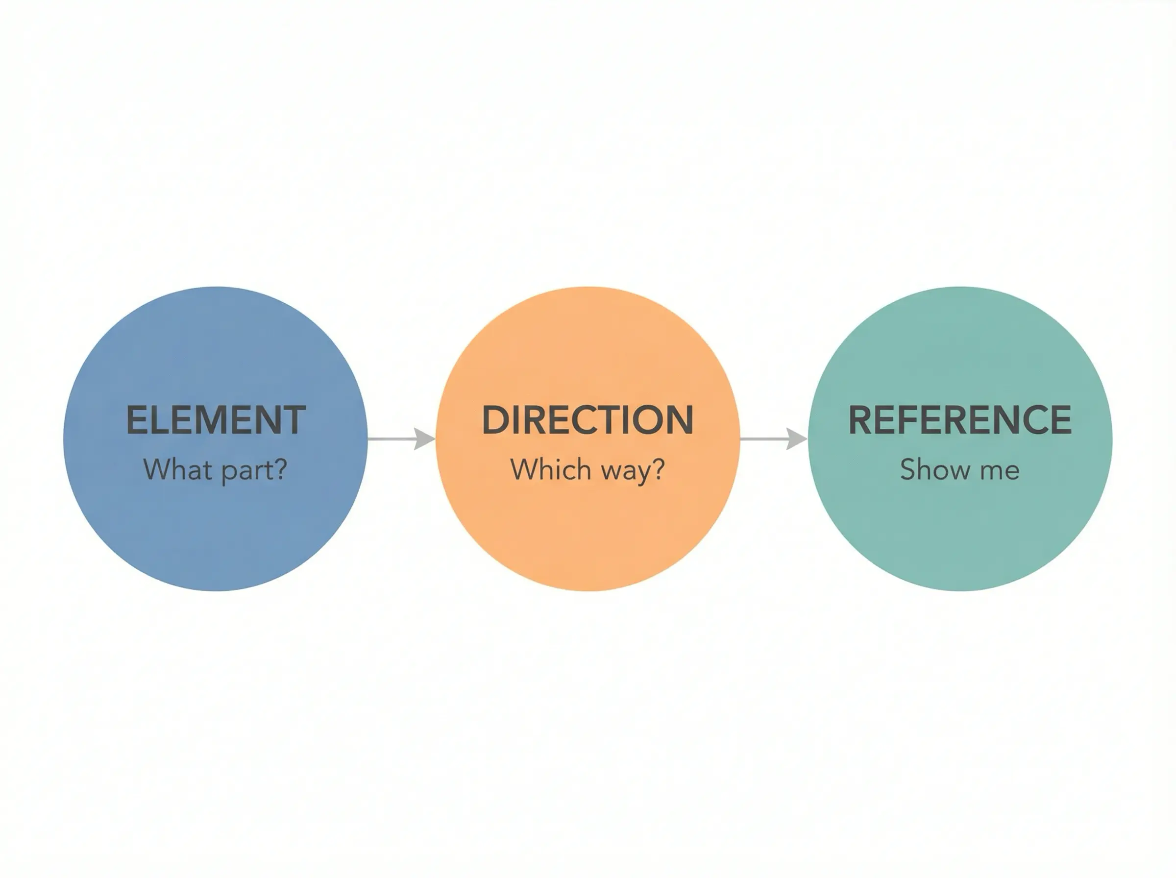
We use a simple framework: Element, Direction, Reference.
Element: What specific part feels off?
Ask: "Is it the colors, the typography, the layout, or something else?"
This prevents you from overhauling the entire design when only one piece needs attention.
Direction: What's the desired shift?
Ask: "Should it feel bolder, quieter, warmer, cooler, more playful, more serious?"
Opposites help. If someone says "not this," ask what sits on the other end of that spectrum.
Reference: What does "right" look like to you?
Ask: "Can you show me an example of something that has the quality you're looking for?"
References cut through hours of guesswork. A client might say "sophisticated," but their reference image reveals they mean "minimalist with lots of white space." Those aren't the same thing.
Common Phrases, Decoded
Here's a cheat sheet we've built over the years:
"Make it pop"
Increase contrast, strengthen the focal point, or add visual tension.
"Make it cleaner"
Reduce clutter, increase white space, simplify the color palette.
"It feels off"
Something breaks the visual rhythm. Usually alignment, spacing, or scale.
"More premium"
Restrained palette, refined typography, generous spacing.
"More friendly"
Warmer colors, rounded shapes, casual typography.
"More professional"
Structured layout, neutral colors, traditional typography.
"I don't love it"
One element is creating friction, but it's not the whole direction.
Notice how each translation points to something specific. That's the goal.
How to Give Better Feedback
If you're the one reviewing creative work, here's how to make your designer's day:
Be specific about location
"The headline feels weak" is more useful than "something's off." "The button gets lost" is more useful than "it needs more pop."
Separate reaction from solution
Say "this section feels cluttered" rather than "remove the icons." The first gives your designer room to solve the problem. The second assumes you've already found the answer.
Use comparisons
"This feels more corporate than we discussed" gives context. "I want it to feel like Mailchimp's website, not a law firm's" gives even more.
Trust the process
Early rounds are supposed to feel unfinished. That's why they're called drafts. Save your detailed feedback for when the structure is locked.
The Real Goal
Good creative feedback isn't about being right. It's about being clear.
When clients and designers speak the same language, projects move faster, revisions shrink, and the final result actually matches the vision everyone started with.
So the next time you want something to "pop," try this instead:
"The headline doesn't stand out enough against the background. Can we increase the contrast or make it larger? Here's an example of the visual weight I'm looking for."
That's feedback a designer can act on.
And if you're the designer receiving "make it pop"? Don't roll your eyes. Grab your translation framework and start asking questions. The answer is in there somewhere.
