Every business owner has heard some version of this advice: "You need a website that converts." And most of them nod, agree, and then end up with a site that looks fine but doesn't actually do anything.
The problem isn't a lack of effort. It's that "conversion" gets treated like a magic quality you sprinkle on at the end. A button color here, a headline tweak there. But a website that consistently turns visitors into leads or clients isn't built from surface-level tweaks. It's structured that way from the ground up.
So what does that actually look like in practice?
Conversion Is a Structure Problem, Not a Design Problem
A common misconception: if the site looks premium, people will take action. Visual quality matters, absolutely. But a beautiful website with no clear path forward is just a digital art piece.
Conversion starts with structure. Every page needs to answer three questions for the visitor:
- Where am I? (Do I understand what this business does within seconds?)
- Is this for me? (Does the message speak to my specific problem or goal?)
- What do I do next? (Is there one clear action I should take right now?)
If a visitor has to think about any of those, you're losing them. Not because your design is bad, but because the architecture underneath it isn't doing its job.
The Five Things That Actually Move the Needle
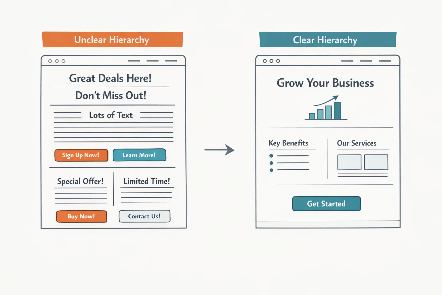
Clear Visual Hierarchy
When someone lands on your site, their eyes need to be guided. Not with flashy animations or auto-playing videos, but with intentional layout choices.
- Headlines do the heavy lifting. Your H1 should communicate what you do and who it's for. Not your company name. Not a clever tagline. A clear statement.
- Sections have a single job. Each block on the page should advance one idea. When a section tries to say three things at once, it says nothing.
- White space is functional. It's not wasted real estate. It's what makes the important stuff stand out.
Speed That Respects People's Time
A one-second delay in page load time can drop conversions by 7%. That's not a guess. That's been measured across millions of transactions and sessions.
Your visitors won't wait for your oversized hero image to load. They'll leave, and they won't come back. Speed is a design decision, and it needs to be treated like one from day one.
What this means in practice:
- Images are compressed and properly sized before they go on the site
- Custom fonts are limited to what's actually needed (two typefaces, not six)
- The site isn't weighed down with plugins, scripts, or third-party tools it doesn't use
- Hosting is fast, reliable, and appropriate for your traffic
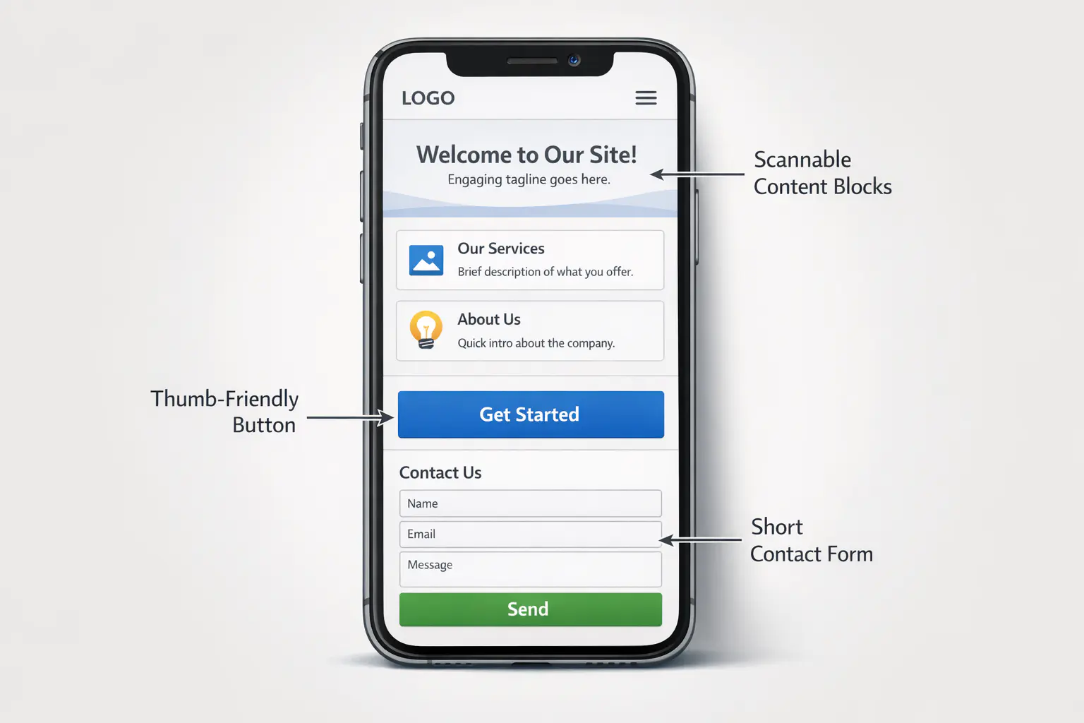
Mobile-First (for Real This Time)
Over 60% of web traffic is mobile. Yet most websites are still designed on a wide desktop screen first, then squeezed down to fit a phone as an afterthought.
That's backwards.
A site built to convert treats the mobile experience as the primary experience. That means:
- Tap targets are generous. Buttons and links are easy to hit with a thumb, not just a mouse cursor.
- Content is scannable. Long paragraphs get broken up. Key information is visible without scrolling through a wall of text.
- Forms are short. If your contact form has more than four or five fields on mobile, most people will abandon it.
The best-performing websites we've built at Studio FLACH start with the mobile layout. Desktop comes second. When you design for constraints first, every version of the site gets sharper.
Calls to Action That Earn the Click
"Contact us" is not a compelling call to action. It's a chore.
A good CTA does two things: it tells the visitor what will happen next, and it makes that next step feel low-risk.
Compare these:
- ❌ "Contact Us"
- ✅ "Book a Free 30-Minute Call"
The second version answers an unspoken question ("What happens if I click this?") and removes friction ("It's free, and it's only 30 minutes"). That small shift in language changes behavior.
A few principles that hold up across every project:
- One primary CTA per page. If everything is important, nothing is.
- Repeat it where it makes sense. Your CTA should appear after your strongest sections of content, not just in the header and footer.
- Match the CTA to the visitor's stage. Someone reading a blog post isn't ready to buy. Offer them something appropriate: a guide, a checklist, a short consultation.
Trust Signals That Do Real Work
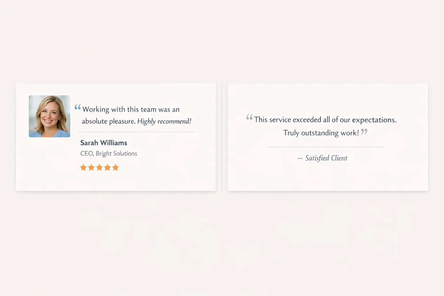
People buy from businesses they trust. On a website, trust is built through specifics, not claims.
Saying "we deliver world-class results" does nothing. Showing a testimonial from a named client, with their photo and business, does a lot.
Strong trust signals include:
- Client testimonials with attribution. Real names, real businesses, real words. Anonymized quotes carry almost no weight.
- Work samples that show range and quality. A portfolio section that lets visitors see the actual output.
- Clear process descriptions. When people understand how you work, they feel safer hiring you.
- Transparent pricing or pricing context. Even a starting price or a pricing philosophy removes anxiety. Silence about cost makes people assume the worst.
The Difference Between a Website and a Sales Tool
A website that just exists is a cost. A website that brings in leads and closes trust gaps is an investment that pays for itself.
The gap between those two outcomes is not about spending more money or adding more pages. It's about building with intention from the start: clear structure, fast performance, mobile-first thinking, direct calls to action, and trust that's earned through proof instead of promises.
That's exactly what our True Space™ process is designed to produce. We don't hand over a pretty homepage and call it done. We build sites that do a specific job for your business, and we test every decision against that goal.
If your current website looks good but isn't generating the results you expected, the fix is probably structural. And it's probably more straightforward than you think.
