A new client asked us last month: "Do I really need all of this?"
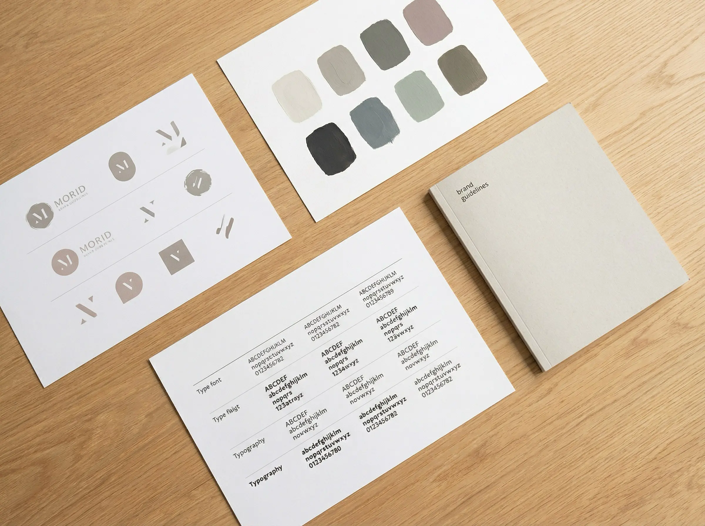
She was looking at a competitor's brand package. Sixty-three pages. Multiple logo "concepts." A color palette with fourteen colors. Eight fonts. Pattern libraries. Icon sets. Illustration styles. Motion guidelines.
Her business has twelve employees.
The honest answer: no. You don't need most of that. But you do need some of it. The trick is knowing which parts.
The confusion is understandable.
Brand identity means different things to different people. Some designers sell logo packages with a primary mark and nothing else. Others deliver hundred-page brand books that collect dust on a shelf. Neither extreme serves most businesses well.
What you actually need depends on where your business is, how you show up, and what you're building toward. But there's a baseline. A set of assets that, when done right, gives you everything required to look consistent, feel credible, and communicate clearly.
Here's what that baseline looks like.
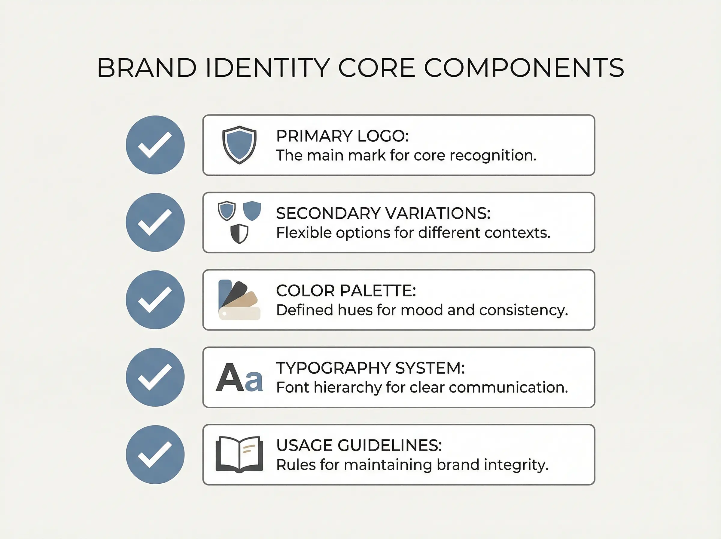
The Primary Logo
This is the main mark. The one that goes on your website header, your business cards, your invoices. It needs to work at large sizes and small. It needs to read clearly in full color and in single color.
A good primary logo is simple enough to remember and distinct enough to recognize. That's the bar.
Secondary Logo Variations
Your primary logo won't work everywhere. Sometimes you need a horizontal version instead of a stacked one. Sometimes you need an icon-only mark for social profiles or favicons. Sometimes you need a simplified version for embroidery or small print applications.
These aren't separate logos. They're variations of the same identity, designed to maintain recognition across different contexts.
Most businesses need two to four variations. More than that usually signals overthinking.
Color Palette
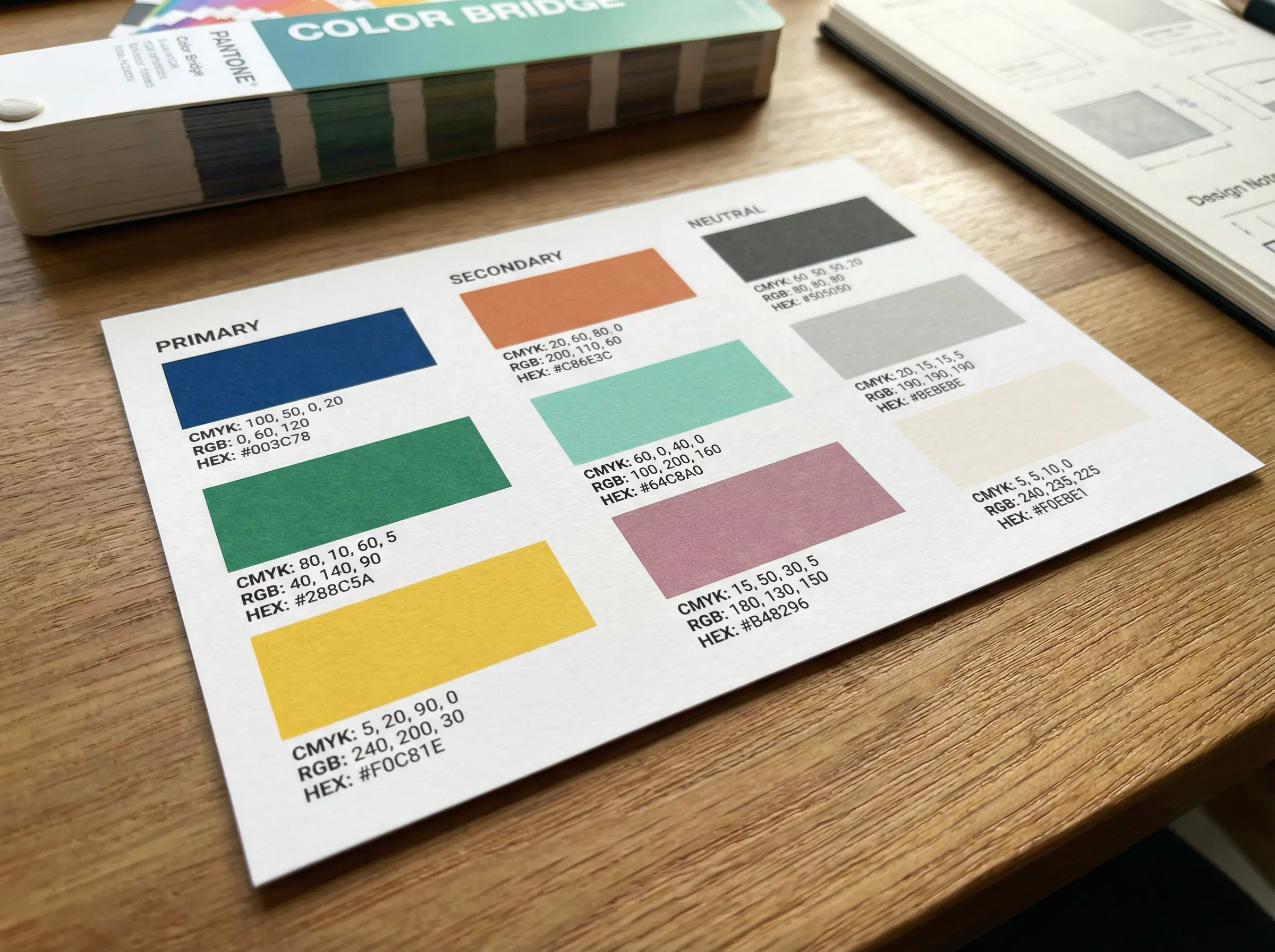
Your colors do heavy lifting. They create mood, signal industry, and build recognition over time.
A functional palette includes:
- One to two primary colors (the dominant tones people associate with you)
- Two to three secondary colors (supporting tones for variety and hierarchy)
- One to two neutral colors (for backgrounds, body text, and breathing room)
Five to seven colors total. That's enough for flexibility without chaos.
Each color should have defined values for print (CMYK and Pantone) and digital (RGB and HEX). Without these specs, your blue will look different on every screen and every print run.
Typography System
Fonts shape how your words feel before anyone reads them. A serif suggests tradition. A geometric sans-serif suggests modernity. A hand-drawn script suggests personality.
Most brands need two typefaces:
- A primary typeface for headlines and emphasis
- A secondary typeface for body copy and supporting text
Some brands work with one typeface in multiple weights. Others add a third for specific applications like pull quotes or navigation. But two is the starting point.
The important part isn't the number of fonts. It's the system. Which font goes where? What sizes? What weights? What spacing? Without these rules, every new piece of collateral becomes a guessing game.
Clear Usage Guidelines
This is where most logo packages fall short. They deliver the files without explaining how to use them.
Guidelines don't need to be a hundred pages. But they should answer the basic questions:
- How much clear space does the logo need around it?
- What are the minimum size requirements?
- What background colors work and which don't?
- How should the logo never be modified?
These rules prevent the slow erosion that happens when different people make different decisions over time.
What's Optional (For Now)
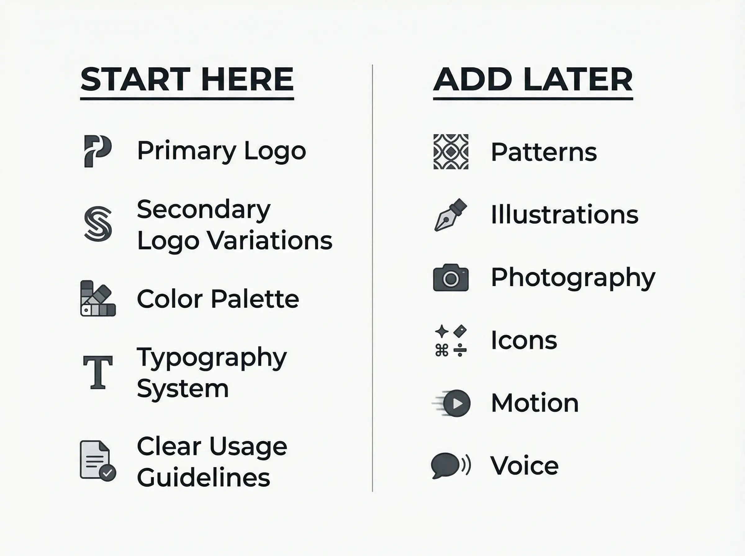
Pattern libraries, illustration styles, photography direction, iconography systems, motion principles, brand voice guidelines, messaging frameworks, social media templates.
All of these can be valuable. None of them are required at the start.
They become necessary when your business reaches a scale where multiple people are creating assets, where campaigns span multiple channels, where consistency requires explicit documentation because institutional memory isn't enough.
If you're a team of two producing most of your own materials, a pattern library will sit unused. If you're a team of fifty with agencies and contractors creating work on your behalf, that same pattern library becomes essential.
Build what you'll use. Expand when you need to.
The Real Test
A complete brand identity answers one question: can someone who isn't you create something that looks like it belongs to your brand?
If the answer is yes, you have what you need. If the answer is no, something is missing.
That missing piece might be a logo variation. It might be color specifications. It might be typography rules. It might be examples of correct and incorrect usage.
Whatever it is, the goal stays the same: consistency without your constant involvement. A system that works when you're not in the room.
Where to Start
If you're auditing your current brand identity, ask these questions:
- Do I have a primary logo that works across common applications?
- Do I have the variations I actually use (icon, horizontal, simplified)?
- Are my colors defined with proper specifications for print and digital?
- Do I have a clear typography system with hierarchy rules?
- Are there documented guidelines someone else could follow?
Any "no" answer points to a gap worth closing.
Any "yes" answer points to an asset worth protecting.
The goal isn't to accumulate more. It's to have exactly what serves the work you're doing now and the growth you're building toward.
