You’ve invested in a powerful brand strategy. You've dialed in your messaging. You’re driving targeted traffic to your website. But then… crickets. The discovery calls aren't booking. The lead-gen forms are collecting digital dust. Why?
The breakdown often happens at the most critical point of the journey: the landing page.
For strategic founders like Olivia and growth-focused marketers like Ethan, a landing page is more than just a digital brochure; it’s a purpose-built machine designed to do one job—convert a specific type of visitor into a lead. If it’s not engineered with precision, it’s not working.
A generic, unfocused page bleeds potential revenue. A high-converting landing page, however, works for you 24/7, qualifying prospects, building trust, and driving your most important business metrics.
So, how do you build one that works? It comes down to mastering its anatomy. Let's dissect the seven critical components that separate a landing page that converts from one that costs you clients.
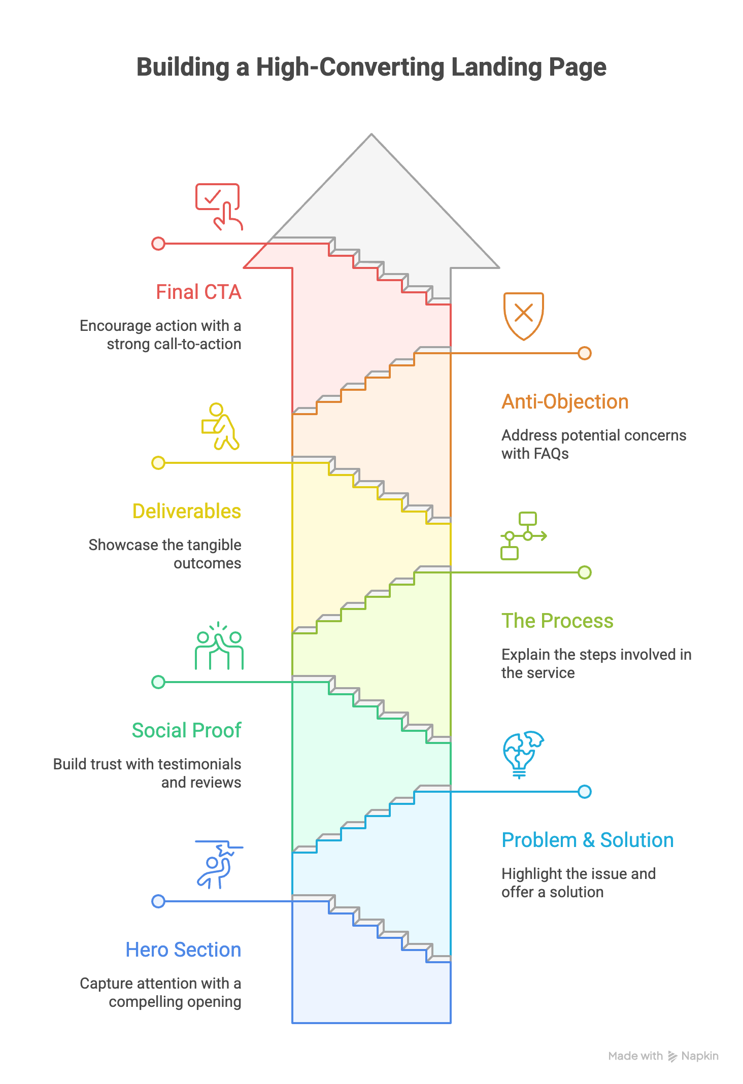
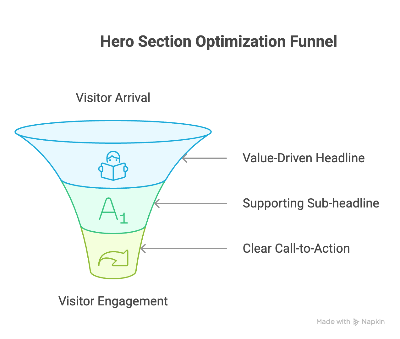
1. The Hero Section: Your 5-Second Test
This is the first thing a visitor sees, and you have about five seconds to pass their test. The only question they’re asking is: "Am I in the right place?" Your hero section must answer with a resounding "Yes."
It needs three things:
- A Value-Driven Headline: This is not the place for clever taglines. State your value proposition clearly and concisely. It should speak directly to your ideal client's primary goal or pain point.
- Weak Headline: "Innovative Business Solutions"
- Strong Headline: "Strategic Branding That Triples Your Inbound Leads"
- A Supporting Sub-headline: This adds context to the headline, explaining how you deliver that value or for whom.
- Example: "We build strategic brand identities and high-performance websites for visionary founders and B2B tech companies."
- A Singular, Clear Call-to-Action (CTA): What is the one thing you want them to do next? Don't offer five different options. Make the primary action obvious.
- Weak CTA: "Learn More"
- Strong CTA: "Book a Discovery Call" or "See Our Case Studies"
Pro Tip: Read your hero section aloud. Does it sound like something a real human would say to explain your business? If it's full of jargon and corporate-speak, rewrite it.
2. The Problem & The Solution: Agitate and Alleviate
Now that you have their attention, you need to prove you understand their world. This section is about demonstrating empathy and establishing your authority.
- Agitate the Pain: Briefly and clearly describe the problem your ideal client is facing. Use their language. This shows you've done your research. For example, instead of "We solve branding issues," try "Are you tired of attracting low-budget clients who haggle on price?"
- Introduce the Solution (Your Service): Frame your service not by its features, but as the direct solution to their pain. This is where you introduce your core offering, like our True Mark™ or True Space™ services, as the clear path forward.
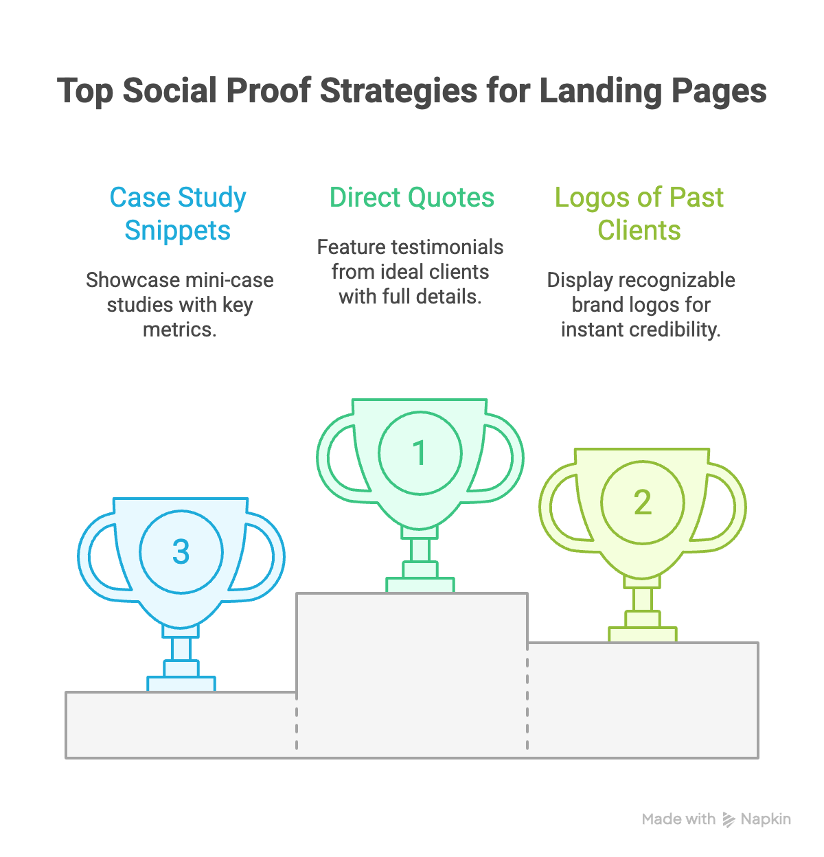
3. Social Proof: Building Unshakable Trust
A visitor won't take your word for it—they'll take the word of others like them. Social proof is non-negotiable for building the trust needed for a high-value conversion.
Use a variety of formats:
- Direct Quotes from Ideal Clients: Feature testimonials from clients who match your ICP. A quote from a "Strategic Founder" resonates with other founders. Include their full name, title, and company.
- Logos of Past Clients: If you’ve worked with recognizable brands, their logos provide instant credibility.
- Case Study Snippets: Show, don't just tell. A mini-case study with a "Before" and "After" and a key metric (e.g., "+150% Qualified Leads") is incredibly powerful.
This section should be impossible to ignore and should scream, "We deliver results for people just like you."
4. The Process: Demystifying the "How"
High-value clients are buying a partnership, not just a deliverable. They need to trust your process. Olivia wants to know there's a strategic framework, and Ethan needs to see a reliable system he can depend on.
- Break It Down: Outline your process in 3-4 simple, clear steps. Use action-oriented titles like "1. Discovery & Strategy," "2. Design & Refinement," "3. Launch & Support."
- Focus on Client Benefits: For each step, explain what it means for them. For example, under "Discovery," explain that this step ensures "complete clarity and confidence before any design work begins."
This transparency removes perceived risk and positions you as a structured, professional partner, not a flighty creative.
5. The Deliverables: Making the Abstract Concrete
What do they actually get? Don't make them guess. Clearly list the deliverables included in your service. For a branding project, this could be:
- A Full Logo Suite (Primary, Secondary, Favicon)
- A Comprehensive Brand Guidelines Document
- Custom Typography & Color Palette
- Business Card & Social Media Profile Designs
This section helps justify your pricing by showing the tangible value and comprehensive nature of your work.

6. The Anti-Objection Section (FAQ): Answering a "No" Before It's Said
Every potential client has silent objections: "Is this too expensive?" "What if I don't like the design?" "How long will this take?"
Address these head-on in a concise FAQ section. This shows confidence and empathy. Include 3-5 of the most common questions you hear during sales calls.
- Q: What is the investment for a service like this?
- A: Our True Space™ website projects start at $12,000. We offer flexible payment plans and focus on delivering an ROI that makes the investment a clear win for your business.
- Q: How do you ensure the final design aligns with our vision?
- A: Our strategy-first process, including mood boards and multiple feedback rounds, is designed to ensure perfect alignment. We don't move to the next stage until you are 100% confident in the direction.
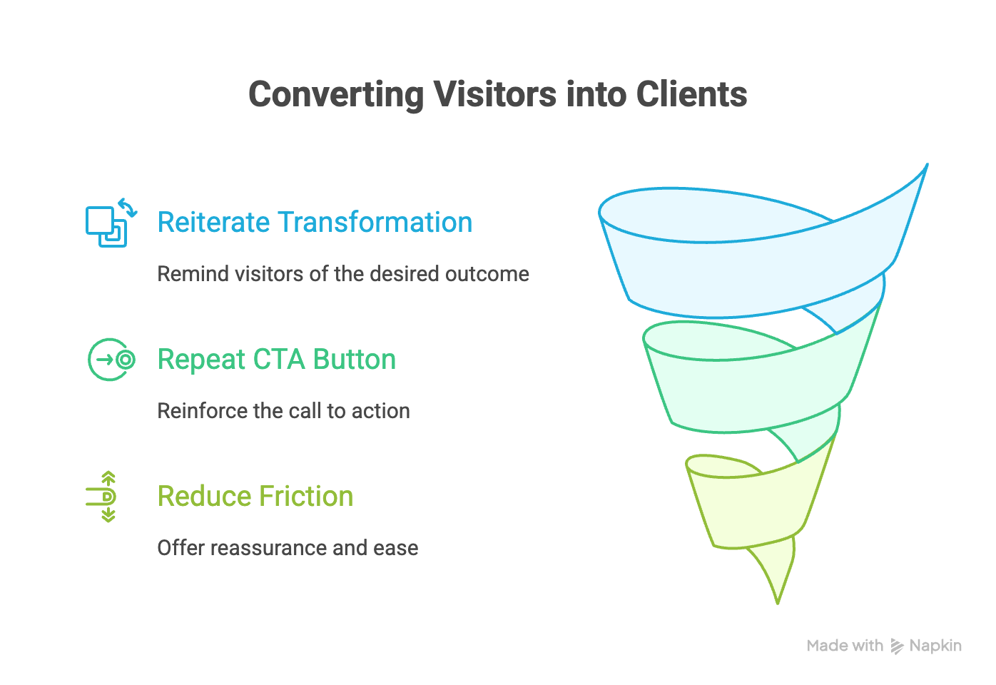
7. The Final Call-to-Action: Sealing the Deal
Don't let the page just... end. Conclude with a final, strong, and benefit-oriented CTA section. It should reiterate the primary value proposition and make the next step feel easy and compelling.
- Reiterate the Transformation: Briefly remind them of the desired outcome. "Ready to build a website that works as hard as you do?"
- Repeat the CTA Button: Use the same clear language as your hero section CTA. "Book a Free Discovery Call."
- Reduce Friction: Add a final line of reassurance. "It's a no-obligation 30-minute chat to see if we're the right fit to help you grow."
By engineering each of these seven components with your ideal client in mind, your landing page transforms from a passive digital document into your most effective salesperson—one that builds trust, communicates value, and consistently converts the right clients.