
Your website works around the clock. It talks to people while you sleep. It answers questions before anyone picks up the phone.
But here's the problem: you can't hear what it's saying.
A weak website doesn't announce itself. It doesn't send you a notification when someone leaves. It just quietly loses you business, day after day, while you wonder why leads have slowed down.
Most business owners assume their website is "fine." It loads. It has their phone number. It shows what they do.
Fine isn't enough.
Fine means forgettable. And forgettable means someone else gets the call.
Here are five signs your website is costing you clients right now.
1. It takes more than three seconds to load.
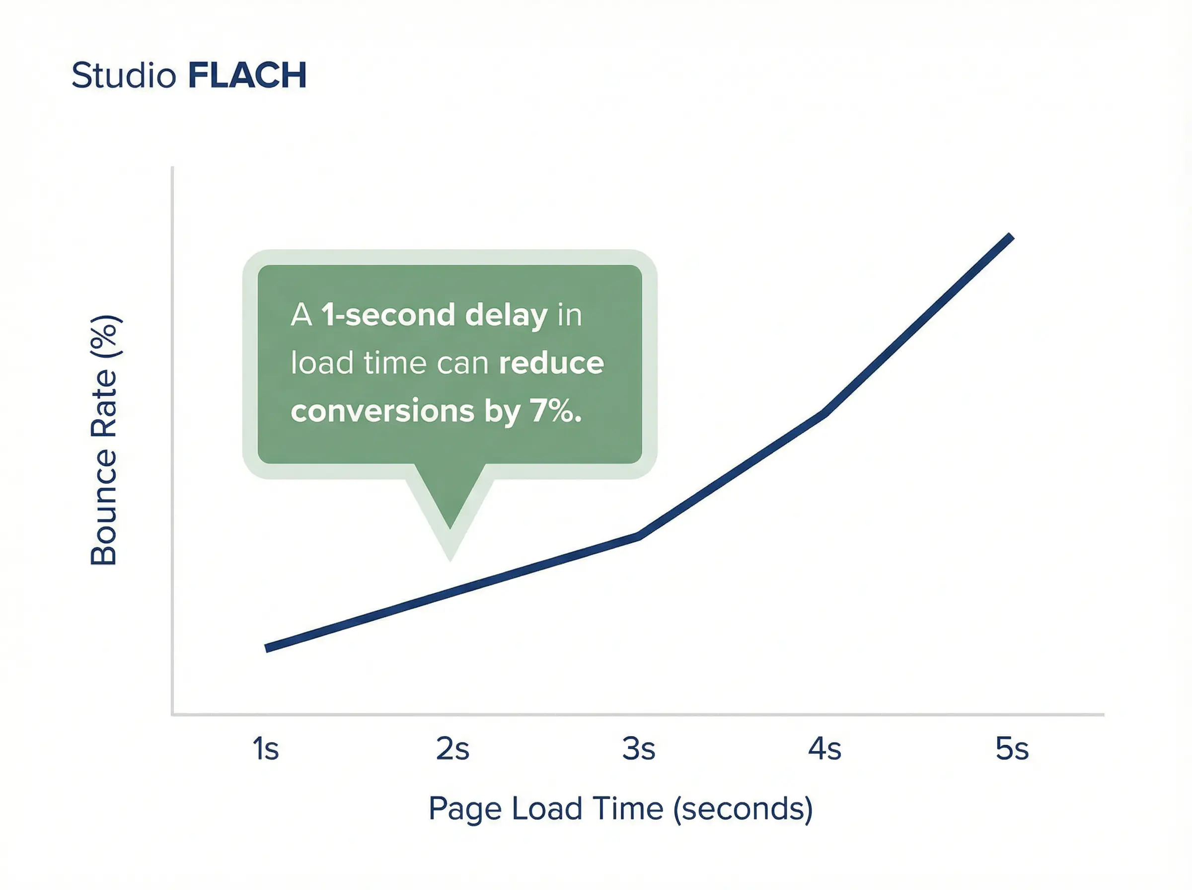
People are impatient. Not rude. Just busy.
If your site takes longer than three seconds to load, nearly half your visitors will leave before they see a single word. They won't wait. They'll hit the back button and click the next result.
You might think your site loads fast because it loads fast on your computer. But your computer has the site cached. Your visitors are loading it fresh, often on a phone, often on a weak signal.
Test your site speed with Google's free PageSpeed Insights tool. If your mobile score is below 70, you have work to do.
Common culprits: oversized images, cheap hosting, bloated plugins, and themes loaded with features you don't use.
The fix isn't always complicated. Sometimes it's just compressing images and cleaning up code. But the impact is real. Faster sites convert better. Period.
2. People can't figure out what you do in five seconds.
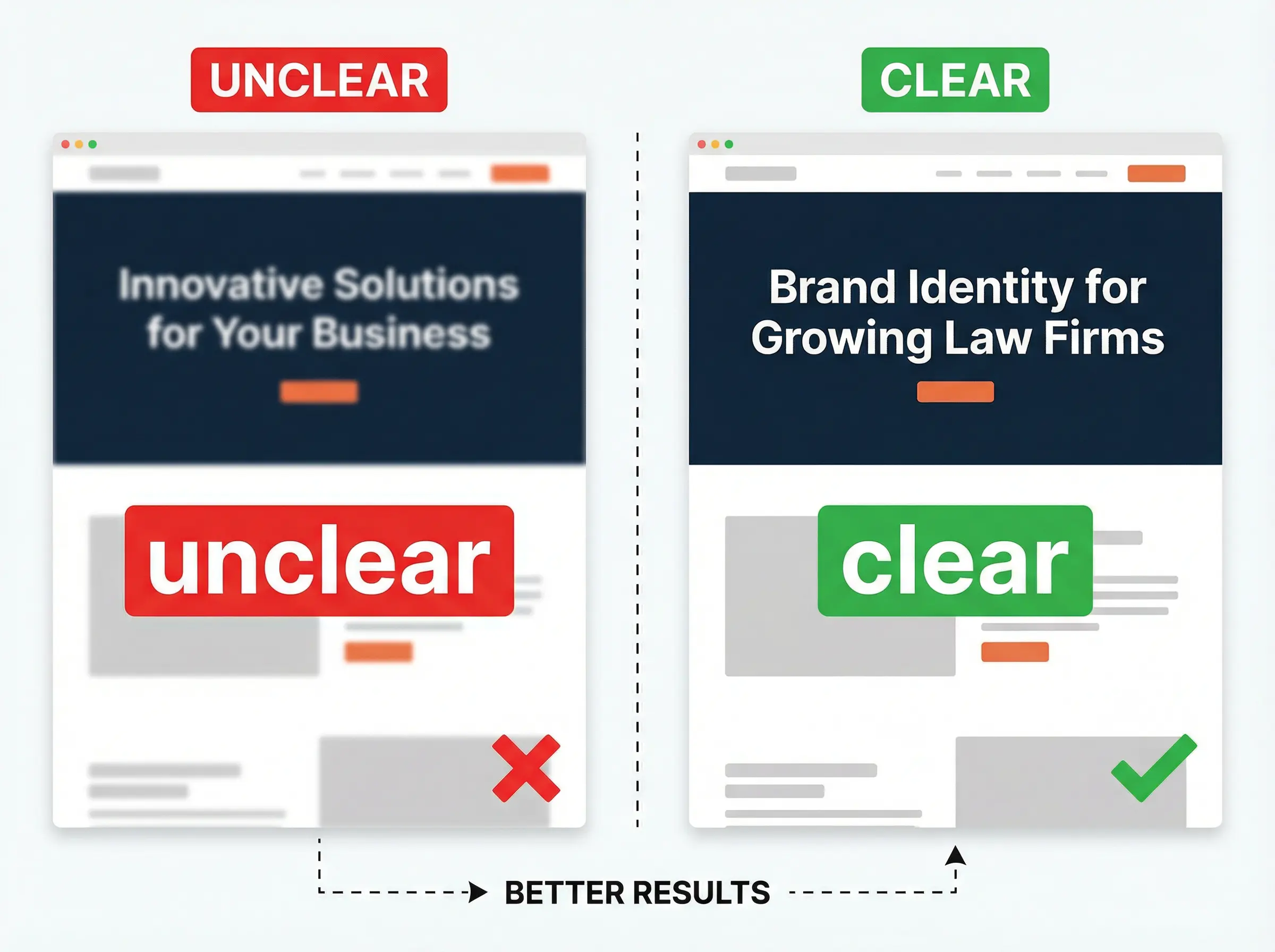
Open your website on your phone. Set a timer for five seconds. Look away.
Now ask yourself: could a stranger tell what you do and who you help?
Most sites fail this test. They lead with vague taglines. "Innovative solutions for modern challenges." "Taking your business to the next level." "Where quality meets excellence."
These phrases say nothing. They could apply to a law firm, a landscaping company, or a software startup.
Your homepage headline should answer three questions fast:
- What do you do?
- Who do you do it for?
- Why should they care?
If a visitor has to scroll, click, or think hard to answer these questions, they'll leave. They have other tabs open. Other options. Other businesses that made it easier to understand.
Clarity beats cleverness. Every time.
3. Your site looks different on a phone than it does on a computer.
More than half of all web traffic comes from mobile devices. For many industries, it's closer to 70%.
Yet most business owners only look at their website on a desktop. They approve designs on a big screen. They miss the problems that show up on a small one.
Buttons too small to tap. Text that requires pinching to read. Images that stretch or stack in awkward ways. Menus that hide important pages.
A site that works beautifully on desktop and breaks on mobile is a site that breaks for most of your visitors.
Pull out your phone right now. Visit your site. Tap every button. Read every headline. Fill out your contact form.
If anything feels clunky, your visitors feel it too.
4. There's no clear next step.
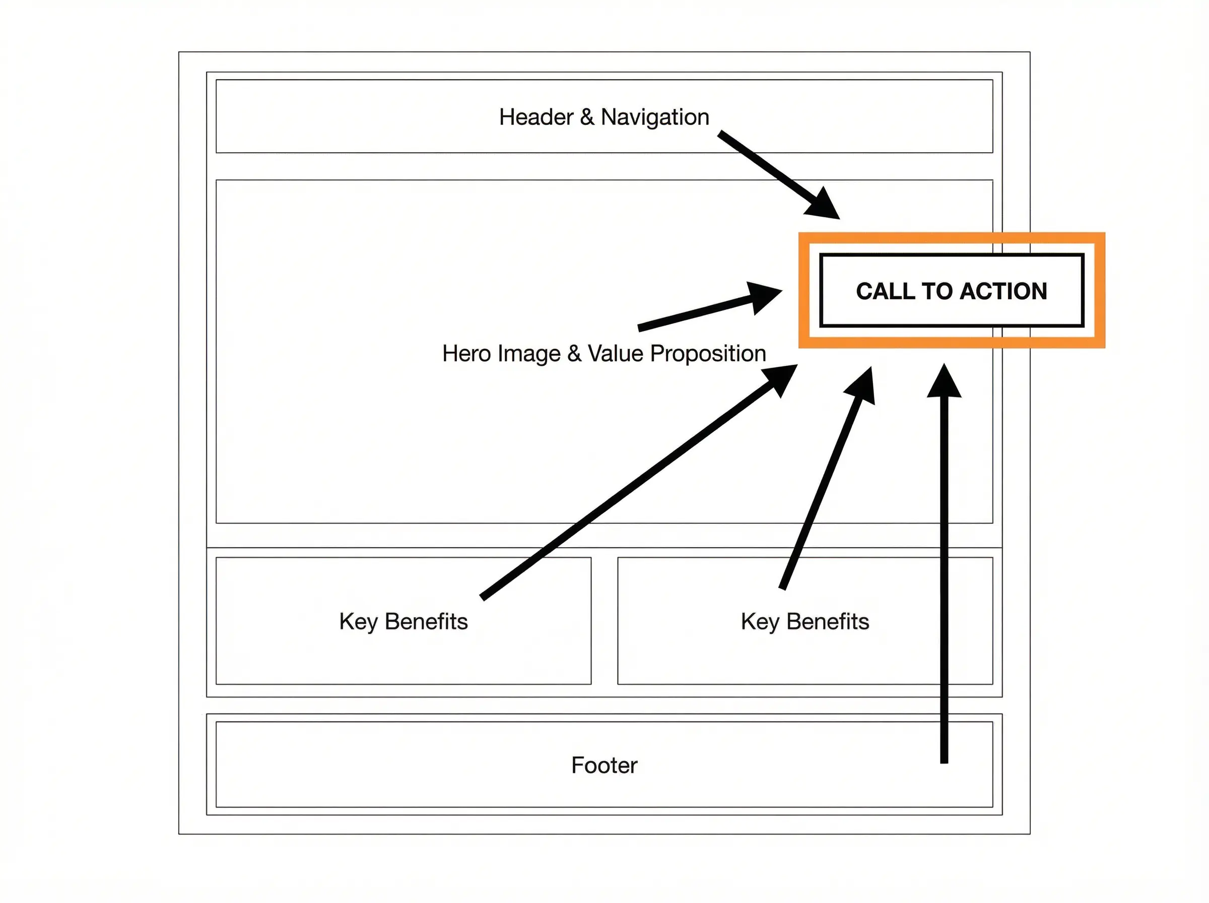
Someone visits your site. They like what they see. They're interested.
Now what?
If the answer isn't obvious, you've lost them.
Every page on your site should guide visitors toward one clear action. Book a call. Request a quote. Download a guide. Start a project.
Not five actions. One.
When you give people too many options, they choose none. This is called decision fatigue. It's real, and it kills conversions.
Look at your homepage. Is there a single, visible button that tells visitors what to do next? Is it above the fold, meaning they don't have to scroll to see it?
Now look at your other pages. Does every page have a clear path forward, or do some just... end?
A website without clear calls to action is a brochure. Brochures don't book clients.
5. You can't remember the last time you updated it.
Websites aren't set-and-forget. They need maintenance.
Old testimonials make you look stagnant. Outdated services confuse potential clients. Broken links and missing images signal neglect.
But the bigger problem is this: your business has probably changed since your site was built. Your offers have evolved. Your messaging has sharpened. Your best clients look different than they did two years ago.
If your website doesn't reflect who you are today, it's attracting the wrong people. Or worse, it's attracting no one.
Set a calendar reminder to review your site every quarter. Check for broken links. Update your portfolio. Refresh your testimonials. Make sure the words on the page match the business you're actually running.
What these signs have in common.
Every one of these problems shares a root cause: the website was built without a clear strategy.
Someone picked a template, filled in the blanks, and called it done. Or a designer made something pretty without asking who it was for and what it needed to accomplish.
A website that works, one that actually brings in clients, starts with clarity. Clarity about your audience. Clarity about your message. Clarity about the action you want visitors to take.
Design comes after.
If you're seeing these signs on your own site, you have two options.
You can fix the symptoms one by one. Speed up the hosting. Rewrite the headline. Add a button.
Or you can step back and ask the harder question: does this site reflect who we are and what we do well enough to earn trust from strangers?
Sometimes a few fixes are enough. Sometimes the foundation needs work.
Either way, your website is talking to people every day. Make sure it's saying the right things.
